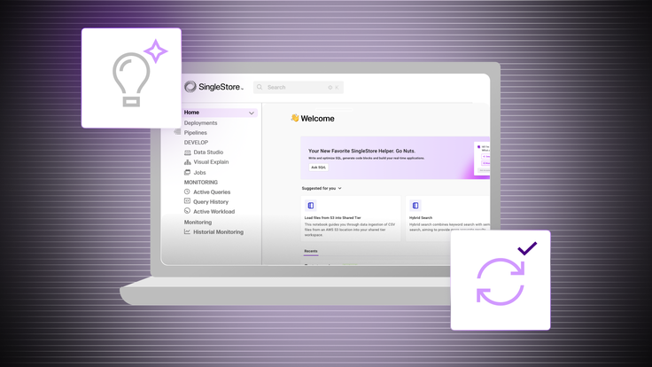
Our Portal platform has recently gone through a UI and navigation revamp (you can read more about it here).
1. Users panic
“My notebooks were deleted.”
“I can’t see any deployments in my organization”
These are some paraphrased quotes we got from internal teams when we started moving things. In the old experience, access to the Notebooks page and the list of deployments were all available on the sidebar. Because this was not maintainable long-term, (and in some cases already required users to scroll through the sidebar), we changed it to a data-agnostic, simple approach. Granted, at the time we didn’t have any kind of in-app announcement that these things were moved.
The immediate reaction from users was that their content was deleted or they lost access. We started to receive messages asking us to debug it. Lucky for us, this time the debug process was easy. This was the first thing we learned: when updating our UI, we need to account for the most extreme reactions from users, so we can better prepare them when we change things. We should never assume that users simply understand things change, and pages move.
2. Visual cues are needed
The messages we received about the “bugs” in our app made us realize we had to teach users about the new pages and options. We quickly understood that we needed visual cues to guide users through the new changes, making the transition from the old to the new UI easier — small icons that catch the user's attention, with some informative text about what the changes encompass.
We’ve also introduced a modal to highlight the main UI changes when users first encounter the new interface. And hopefully, this helps ensure they immediately recognize the updates. However, we didn't want to rely solely on the modal, knowing how quickly users can dismiss it without reading. By combining the modal with small indicators, we believe we've achieved the right balance.
We might be able to teach users about new changes, but there is always a period of uncertainty/uncomfortableness with them — whether a small or major UI change. They tend to dislike the new experiences and resist the change, as they are used to the old flow already. Have you ever moved dishware to a new cabinet, but you still open the cabinet to its old spot countless times? It’s the same feeling! We saw around 15% of internal users going back to the old experience when we first enabled it, even if the new one is much more optimized and adapted to the new workloads. Eventually, this learning period passes, and users get accustomed to the new UI.
3. Old habits die hard
“I can’t create a new workspace group”
Before adding the “create deployment” button to the sidebar, we only added the new deployment button to be inside the deployment switcher. When we enabled the new UI internally, we got several complaints from users who couldn’t figure out how to create a new deployment. Admittedly, the location of the new deployment button wasn’t as clear as the previous button on the sidebar. We took the feedback and added the button again to the sidebar. We will monitor this and compare the percentage of users who use each button to back up any future decisions.
Nevertheless, this experience made us realize that users become very accustomed to a particular UI — and often don't notice changes unless they are highly visual. When something in their routine changes, it can be challenging for them to locate where things have moved and how to perform the same actions. And hopefully, in the last couple of weeks, we learned how to better help them.